
Abstract
Non–information technology (IT) professionals and nonexpert casual users are increasingly adopting self-service business intelligence (SSBI) tools (such as Tableau, Qlik, and Power BI) to create data visualization dashboards. This study identified the most relevant dashboard design principles for SSBI tool users. The research approach included organizing a focus group in which most of the participants were non-IT professionals in health care, extracting recommended principles from the literature, applying these recommended principles by using data on quality of diabetes care to design relevant dashboards, and proposing the following 5S dashboard design principle framework: 1) seeing both the forest and trees, 2) simplicity through self-selection, 3) simplicity through significance, 4) simplicity through synthesis, and 5) storytelling. The third and fourth principles are novel and provide solutions to decision-making problems (such as conflicting results from excessive and discordant indicators) encountered by health care professional in the public sector as well as in other domains. The 5S dashboard design principles are easily memorized and practical and thus enable non-IT professionals and nonexpert casual users to design insightful dashboards efficiently by using SSBI tools.
Author Contributions
Academic Editor: Shangming Zhou, Senior Lecturer Swansea University Medical School.
Checked for plagiarism: Yes
Review by: Single-blind
Copyright © 2018 Ching-Yi Lin, et al.
 This is an open-access article distributed under the terms of the Creative Commons Attribution License, which permits unrestricted use, distribution, and reproduction in any medium, provided the original author and source are credited.
Competing interests
The authors have declared that no competing interests exist.
Citation:
Introduction
In the age of big data, people are cognitively overloaded with vast amounts of information. Business intelligence and analytics, particularly data visualization dashboards, are solutions to present insightful information to target users efficiently 1. A dashboard is defined by Few as “a visual display of the most important information needed to achieve one or more objectives; consolidated and arranged on a single screen so the information can be monitored at a glance” 2, 3. In a recent review, Sarikaya et al. organized 15 aspects of a dashboard into four categories: purpose (strategic, tactical, and operational decisions and learning), audience (circulation, required visualization literacy, and required domain expertise), visual features (construction and composition, multiple pages, interactive interface, highlighting and annotating, and modifying state of the data or world), and data semantics (alerts and notification, benchmarks, and updating) 4.
A commonly encountered difficulty in dashboard design is that information technology (IT) engineers who are skilled at programming might not be familiar with the domain knowledge and mindset of professionals (e.g., medical doctors, nurses, scientists, lawyers, accountants, journalists, and artists) in different fields. By contrast, domain professionals specialized in a particular field might be unaware of IT techniques that can help them unfetter their imagination and create attractive dashboards. IT engineers and domain professionals must discuss at length to create best-fit dashboards.
Dashboards are for not only professional situations but also personal and recreational purposes. For example, Shneiderman et al. stated that casual users at home need to navigate thousands of movies to find the perfect entertainment for a night in, browse hundreds of social media updates daily to keep abreast of their circle of friends, and scan through thousands of product reviews to find the right toaster to buy 5. This development has been termed as “casual visualization,”which involves nonexpert users 6.
In response to the aforementioned difficulties and trends, self-service business intelligence (SSBI) has been developed. User-friendly SSBI tools (such as Tableau, Qlik, and Power BI) can help non-IT professionals and nonexpert casual users to perform custom analytics and to derive actionable information from large amounts of data without involving IT experts 7, 8, 9.
Because SSBI tools are increasingly used by various target audiences, we aimed to derive dashboard design principles to present insightful information to target users efficiently. This paper is structured as follows. Section 2 presents the research approach. Section 3 provides the recommended design principles from the literature. Section 4 illustrates dashboards created by a focus group applying the recommended principles by using data regarding quality of diabetes care. In Section 5, 5S dashboard design principles are proposed. Finally, the benefits and challenges of 5S principles are discussed, and conclusions are drawn in Section 6.
Research Approach
The research approach is based on the four main steps illustrated in Figure 1.
Figure 1.Research steps
Organizing a Focus Group
The focus group comprised 10 participants: two IT engineers, three medical doctors (one of whom was in charge of quality of care and patient safety assurance at a hospital), three nursing specialists (two of whom were case managers for diabetes care), and two public health administrators (one of whom was in charge of a diabetes care network). All the participants were interested in using SSBI tools to design dashboards to present their works. The focus group met every week for 12 weeks and spent 2 hours in discussion at each meeting.
Extracting Design Principles
We searched Scopus, Google Scholar, and PubMed by using the keywords “data visualization,” “dashboard,” “design,” and “principle.” We excluded some literature regarding algorithms and IT techniques. For the literature specific to design principles, we further checked references and citations for the additional relevant literature. The participants of the focus group were asked to read the literature and abstract recommended design principles.
Applying Design Principles
The participants of the focus group were asked to design performance dashboards on the quality of diabetes care of clinics and hospitals in Taichung City by using the recommended dashboard design principles. The quality of diabetes care data set was obtained from open data released by the Taiwan National Health Insurance Administration (https://data.nhi.gov.tw/Datasets/DatasetDetail.aspx?id=68&Mid=A110100).
Proposing New Design Principles
During the meetings, the participants of the focus group illustrated the dashboards they had designed and shared their experience of applying the recommended design principles. The participants were asked to provide comments and suggestions on dashboards created by other participants. After several rounds of discussion, the focus group proposed the 5S design principles for SSBI tool users.
Recommended Design Principles
In this section, we first present general principles for dashboard design suggested by four highly cited scholars; subsequently, recommendations from three sectors related to the case study are proposed in the following section.
Tufte’s Data-Ink Ratio
Tufte suggested that five principles in the theory of data graphs produce substantial changes in graphical design:
Above all else, show the data
Maximize the data-ink ratio
Erase nondata ink
Erase redundant data ink
Revise and edit
The data-ink ratio is defined by Tufte as the proportion of a graphic’s ink devoted to nonredundant display of information. Maximizing the share of data ink means that larger shares of a graphic’s ink devoted to data are preferable (with other relevant matters being equal). All ink on a graphic requires a purpose, and nearly always that purpose should be to present new information 10.
Few’s Highlighting and Organizing Objective
Derived from the concept of the data-ink ratio, Few recommended two principles for highlighting objectives: “reducing the non-data ink” and “enhancing the data ink” 2, 3, 11.
To reduce nondata ink, we must first remove unnecessary nondata ink and then deemphasize and regularize the remaining nondata ink. Removing unnecessary nondata ink begins by asking the following question regarding each visual component: “would the data suffer any loss of meaning or impact if this was eliminated?” If not, then remove it. If the ink does not support the message, it does not serve the purpose of communication. Nondata items, consistent with their supporting role, should stand out from the background sufficiently to serve their purpose but not so much that they draw attention to themselves. This can be achieved through the use of thin lines and soft, neutral colors (e.g., light gray).
Enhancing data ink involves two steps. The first step is to remove unnecessary data ink; the second is to emphasize the most crucial data ink. Do not remove anything crucial, but ensure anything peripheral to the interests and purposes of readers is removed.
Regarding the organizing objective, designers of communication must organize information for readers in a manner that tells the story as clearly as possible. When we arrange information on a dashboard, we do it consciously to tell a story. What should I say first? What should I save for the last? What should emphasize more than the rest? The answers to these questions take on the form of visual attributes designed to accomplish the following:
Group (i.e., segment information into meaningful sections)
Prioritize (i.e., rank information by importance)
Sequence (i.e., provide direction for the order in which information should be read)
Shneiderman’s Visual Information Seeking Mantra
Shneiderman proposed a useful starting point for designing an advanced graphical user interface, the “Visual Information Seeking Mantra: Overview first, zoom and filter, then details-on-demand” 12. He proposed a task taxonomy for information visualization. Tasks are task-domain information actions that users wish to perform. The seven highest order taxa of abstraction tasks are as follows.
Overview: gain an overview of the entire collection
Zoom: zoom in on items of interest
Filter: filter out uninteresting items
Details-on-demand: select an item or group and obtain details when needed
Relate: view relationships among items
History: keep a history of actions to support undo, replay, and progressive refinement
Extract: allow extraction of subcollections and query parameters
To provide concrete guidance for designers attempting to build novel visualization tools, Heer and Shneiderman presented a further taxonomy of interactive dynamics that contribute to successful analytic dialogues 13. The taxonomy consists of 12 task types grouped into three high-level taxa: data and view specification (visualize, filter, sort, and derive); view manipulation (select, navigate, coordinate, and organize); and analysis process and provenance (record, annotate, share, and guide). These categories incorporate critical tasks that enable iterative visual analysis, including visualization, interactive querying, multiview coordination, history, and collaboration.
Munzner’s Nested Model for Visualization Design
Munzner proposed a nested four-level model for visualization design and evaluation. The top level is for characterizing the problems and data of a particular domain, the next level is for mapping those into abstract operations and data types, the third level is for designing visual encoding and interactions to support those operations, and the innermost fourth level is for creating an algorithm to execute that design automatically and efficiently. Munzner conjectures that many past visualization designers have performed these steps, albeit implicitly or subconsciously and not necessarily in that order. Our goal in making these steps more explicit is to provide a model that can be used to either analyze existing systems or papers or guide the design process itself 14, 15.
Munzner further identified two common strategies for visualization dashboard design: top down or bottom up. With problem-driven work, you start at the top domain level and work down through abstraction, idiom, and algorithm decisions. In technique-driven work, you work at one of the bottom two levels, idiom or algorithm design, where your goal is to invent new idioms that support existing idioms 15.
Dashboard Design Principles in the Business Field
Many nonacademic guidebooks discuss dashboard design principles in the business field, and most of the suggested principles have been derived from principles discussed in the previous sections 16, 17, 18, 19, 20, 21, 22, 23, 24, 25. Wexler et al. contented there is no perfect dashboard; that is, one perfect collection of charts that ideally suits every person who may encounter it. The authors suggested using various scenarios in business fields and helping designers modify relevant dashboards. The scenarios they proposed included comparing individual performance with peer performance; performing what-if analysis; ranking by “now” and comparing with “then;” determining whether pace is sufficient to reach goals; identifying multiple key performance metrics; performing web, patient history, and sentiment analysis; showing rank and magnitude; showing actual versus potential utilization; and monitoring productivity 25.
Dashboard Design Principles for the Public Sector
Because some participants of the focus group were working in the public sector, we also searched for the literature related to the public sector. After an extensive review, Matheus et al. summarized overall design principles for public sector dashboards: collect accurate and precise data, customize views, support different views, present clearly, offer decision-making support, offer interaction support, provide overviews and details, focus on creating public values, ensure real-time updates of data, and ensure institutional support 26. They also identified strategic and political benefits of public dashboards: overview at a glance; drilling into detail; transparency; customer-, user-, or visualization-oriented presentation; fraud and corruption detection; trend visualization; accountability; fast and effective decision- and policy-making; external knowledge mobilization; effectiveness and efficiency improvement; relevant information disclosure; interactivity; and public participation in service improvement.
Maheshwari and Janssen also suggested eight design principles for the public sector: customizing metrics; using existing data resources for selecting metrics; linking performance metrics to overall processes and procedures; analyzing the effects of alternative improvement options; making visual communication available at a glance for monitoring, analyzing, and assessing performance; integrating several small dashboards into one; offering data interpretation support; and learning and growing 27.
Dashboard Design Principles for the Health Care Sector
Because empirical data used in this study related to health care, we included additional literature on dashboard design for the health care sector 28, 29, 30, 31, 32, 33, 34, 35, 36, 37, 38, 39. A primary goal of a dashboard is to present useful information clearly. However, Baskett et al. reminded us that most dashboards support different types of users making different types of decisions 28. They further suggested that one way to achieve this goal is to use drill-down features. The dashboard home page usually provides general information regarding the dashboard and access points to different functional areas. The summary page is essential in the drill-down sequence because it provides the overview and should map what is emphasized in each part of the dashboard. Drill-down capabilities vary from drilling to an application, more detailed information, or even a source document. The depth depends upon user needs for detailed and organized information 28.
Park et al. proposed the attributes of an ideal dashboard used as a decision-making tool for hospital organization: alignment with organizational goals, accurate contextual data, intuitive display with alert functions, real-time display of data, logical hierarchy of information (drill-down capability), an internet or intranet basis, and an organizational culture that accepts use of objective data for decision-making 29.
To design effective dashboards for the public health care system, Jinpon et al. suggested supporting different metric sets for different goals and context-specific help; enabling organization- and project-level displays; enabling hyperlinks that display tabular formats of underlying data and hyperlinks to drill down hierarchically to more detailed data; defining points of contact that identify who is responsible for feedback and follow-up; displaying data trends, the date through which data are current, lower and upper control limits, and providing hyperlinks for displaying outliers; utilizing different types of displays or gauges for different types of data; and highlighting overall metric status using red, yellow, and green or a similar indicator system 30.
Because the data set for practicing the recommended dashboard design principles was related to the quality of diabetes care, we selected one study on designing dashboards for diabetes care, considered the following. The first consideration was the utility to investigate specific clinical questions through drill-down functionality to allow identification of subjects not compliant with guidelines and section off their data individually. The second consideration was the analysis of disease progression through a care flow mining algorithm to allow identification of frequent clinical pathways and their temporal features in the population of patients treated at a hospital. The third consideration was the comparison of the patient population at two different time points39.
Using Storytelling to Design Dashboards
Several nonacademic guidebooks18, 22, 23 and academic papers 40, 41, 42, 43, 44, 45, 46, 47, 48, 49 have highlighted the power of conveying insightful information through storytelling in visualization dashboards. In one frequently cited study, Segel and Heer conducted a design space analysis of narrative visualizations intended to convey stories. They identified seven distinct genres (magazine-style, annotated chart, partitioned poster, flow chart, comic strip, slide show, and film/video/animation) of narrative visualization and three narrative structures (martini glass, interactive slideshow, and drill-down story) to support storytelling with data.
They also emphasized a central concern in the design of narrative visualizations: the balance between author-driven elements (providing narrative structure and messaging) and reader-driven elements (enabling interactive exploration and social sharing).
Because visualization researchers and practitioners are increasingly adopting the notion of storytelling to build narrative visualizations that explain their findings using locations, characters, and plot, Tableau (an SSBI tool) released its Story Points mode in 2013 to help people create these data stories themselves 5. In Tableau, each Story Point can contain one worksheet or dashboard, and you can provide context to the sheet by adding text to captions contained in a navigation bar across the top of the display 50. To build effective stories, Murray suggested the following steps 50:
Decide what type of story you want to tell
Build evidence in Story Points to support your thesis
Organize your arguments in a logical sequence
Add descriptions and annotations that highlight crucial evidence
Provide supporting details
After reviewing the published literature on design principles for visualization dashboards, we used real-world data to apply these principles as described in the next section.
Applying Design Principles Using Real-World Data
Based on the recommended design principles extracted from the literature, the participants in the focus group were asked to design performance dashboards for quality of diabetes care of clinics and hospitals in Taichung City. The data set comprised 17 variables for 918 clinics and 62 hospitals in Taichung City from 2011 to 2017. Only clinics and hospitals caring for at least 20 patients with diabetes were included in the analysis and dashboard design.
The main outcomes of interest for dashboards were four process indicators of the quality of diabetes care corresponding to the percentage of patients with diabetes in each clinic or hospital in which physicians ordered HbA1c, blood lipid, microalbumin, and eye fundus examination at least once a year. According to treatment guidelines, patients with diabetes should receive these examinations at least once a year. Ideally, percentages should all be 100%. However, in reality, medians for the four indicators were 93% for HbA1c, 80% for blood lipids, 21% for microalbumin, and 20% for eye fundus in 2017. The logic of dashboard design is illustrated in Table 1 based on Munzner’s four-level nested model 14, 15.
Table 1. Logic of dashboard design based on Munzner’s four-level nested model.| Nested level | Dashboards for quality of diabetes care in Taichung City |
| Domain situation | The purpose of dashboards is for the Health Bureau of the Taichung City government to monitor the quality of diabetes care in Taichung City. Specific questions of concern are 1) What is the quality of diabetes care in Taichung City compared with other cities in Taiwan? 2) What is the quality of diabetes care of each clinic/hospital in Taichung City? 3) How does the quality of diabetes care vary among clinics and hospitals in Taichung City? and 4) Which clinics or hospitals performed the worst in caring for patients with diabetes? |
| Data/task abstraction | To help users to easily recognize quality, the four quality indicator variables on quantitative scales were converted to an ordinal scale (good quality = 3, fair quality = 2, and poor quality = 1). We also summed the score of the four indicators into one total quality score (12 is the highest and 3 is the lowest). |
| Visual encoding/ interaction idiom | Bar charts were used to compare the quality of diabetes care in Taichung City with other cities in Taiwan. A choropleth map with a sequential color scheme was used to illustrate variations in the quality of diabetes care of 29 districts in Taichung City. Traffic light charts were used to rank the quality of diabetes care among clinics and hospitals. A map showed the address of each clinic or hospital with pop-outs to show the details of the quality information. A boxplot was used to illustrate the distribution quality of diabetes care among clinics and hospitals by indicator. Bubble scatterplots were used to reveal correlations between indicators among clinics and hospitals. |
| Algorithm | We did not create an algorithm to perform any operations automatically. |
All dashboards designed by the participants of the focus group can be accessed at the following open website:
https://public.tableau.com/profile/robert.lu#!/vizhome/QualityofDiabetesCareinTaichungCity_0/Story
Proposing a New Design Principle Framework
When applying the design principles suggested in the literature, the participants of the focus group found some principles lacking from a domain knowledge perspective. After several rounds of discussion, the focus group proposed a new design principle framework. The focus group suggested using an easily memorized term for the dashboard design principle framework. Mimicking the 5S workplace organization method based on five Japanese words (seiri, “sort”; seiton, “set in order”; seiso, “shine”; seiketsu, “standardize”; and shitsuke, “sustain”) 51, the focus group proposed a 5S dashboard design principle framework of seeing both the forest and trees, simplicity through self-selection, simplicity through significance, simplicity through synthesis, and storytelling. The following describes the 5S principles with some illustrations.
Principle 1: Seeing Both the Forest and Trees
This principle is derived from Few’s organizing objective (group, prioritize, or sequence) and Shneiderman’s mantra depicted in Section 3.2 and 3.3. The principle of seeing both the forest and trees has two implications. The first implication is that the whole (forest) must be classified into different regions or parts based on certain characteristics (types of trees, animal habitats, or geographical features) so that users can identify which part of the forest they should search to find what interests them. The designer can establish a visual outline (a table of contents) as a structure for communication.
For the example of quality of diabetes care, the focus group used the Story Point function in Tableau to create a table of contents based on geographical hierarchy (Figure 2): city or county (A), district (B), and neighborhood (C). On the neighborhood dashboard (Figure 2C), users can identify each clinic (tree) in the selected district (particular region of the forest) and find details on quality of care (the leaves of a particular tree) displayed in tooltips that pop up when hovering the cursor over the clinic.
Figure 2.Example of principle 1, seeing both the forest and trees; storyboarding for quality of diabetes care in Taichung City, Taiwan, based on a hierarchy of geographical units: (A) city/county, (B) district, (C) neighborhoods and clinics. https://public.tableau.com/profile/robert.lu#!/vizhome/QualityofDiabetesCareinTaichungCity_0/Story
The second implication is the ability to see both the forest and trees on one dashboard. For example, Figure 3A presents a bar chart of three medical centers and ten regional hospitals according to their total quality score (forest view). Details of the four quality indicators (leaves) of a particular hospital (tree) can be revealed by hovering over the desired hospital (i.e., MC1 in Figure 3B), and detailed trends for the four indicators of that hospital from 2011 to 2017 can also be viewed in this way.
Figure 3.Example of principle 1, seeing both the forest and trees; the quality of diabetes care of three medical centers (MCs) and ten regional hospitals (RHs) in Taichung City, Taiwan. (A) Bar chart showing the total quality score of all hospitals (forest); (B) line chart of four process indicators for MC1 by year (trees). https://public.tableau.com/profile/robert.lu#!/vizhome/QualityofDiabetesCareinTaichungCity_0/Story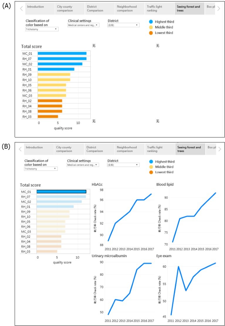
Principle 2: Simplicity Through Self-Selection
Almost all guidebooks and scholars emphasize the importance of simplicity in dashboard design. Please see Tufte’s data-ink ratio in Section 3.1 and Few’s two principles of reducing nondata ink and enhancing the existing data ink in Section 3.2. To achieve the goal of simplicity, the focus group derived three operational principles for simplicity: self-selection, significance, and synthesis.
With regard to self-selection, several terms and techniques have been used in the literature in Section 3, such as selection, filtering, drilling down, and details-on-demand. A crucial feature of a dashboard is that users can select the dimension or category that interests them through the filtering function, which is the most essential feature of any SSBI tool. In the quality of diabetes care example, users can select the year or clinical setting (Figure 2A), quality indicator (Figure 2B), or district (Figure 2C) that interests them. Because there are 918 clinics in Taichung City, we created the district selection filter point consisting of 29 districts to enable viewing the map of one district within one dashboard to achieve the goal of simplicity.
Principle 3: Simplicity Through Significance
One main goal of a dashboard (and, in fact, of all data analysis) is to provide actionable information. An effective dashboard facilitates identification of vital information, which can be used by decision makers to determine whether to take action. The decision making at population health level is different from the decision making at clinical level. At clinical level, the doctor found that a patient’ average HbA1c level was 9.2% ± 0.8%, which was significantly higher than the treatment goal of 7%. This information suggested to the doctor that some actions should be taken, such as changing the dosage of antidiabetic drugs, replacing the current drugs with others, or using insulin injections.
However, at population health level, it is sometimes difficult to provide actionable information if there is no consensus gold standard. For example, it is difficult to judge the quality of diabetes care provided at a given hospital if the HbA1c checkup rate is 90% (i.e., nine of ten diabetes patients at that hospital had their HbA1c checked during a given year). Ideally, the checkup rate should be 100%. However, in reality, there are large variations across clinical settings for different indicators. In this situation, we must use statistics to determine the benchmark or reference for judgement.
In this study, the focus group suggested two ways to determine significance. The first was the trichotomy method; clinics and hospitals were grouped into an upper, middle, and lower third based on their checkup rates. The clinics and hospitals in the lower third were arbitrarily defined as providing poor-quality diabetes care.
The second method was statistical testing. The focus group used an average checkup rate of all clinical settings in Taichung City as the benchmark (or reference). Only clinics and hospitals with a checkup rate significantly lower than the average rate of Taichung City were defined as providing poor-quality diabetes care. The focus group compared the 95% confidence intervals of checkup rates of each clinic or hospital with those of average checkup rates. If these confidence intervals did not overlap, the checkup rate of a given clinic or hospital was considered to be statistically significantly different from the average checkup rate. This same method has been used to determine whether state mortality rates are significantly higher or lower than the average rate in the United States 52, 53.
In the traffic light chart (Figure 4), the focus group used the color orange to denote hospitals with poor-quality diabetes care (consider some of the readers are color blindness, we changed red into orange and green into blue). Coincidently, the four hospitals with an orange light according to the trichotomy method (Figure 4A) were the same as those identified through statistical testing (Figure 4B), thus providing stronger evidence for decision-making.
Figure 4.Example of principle 3, simplicity through significance; traffic light chart of the quality of diabetes care of three medical centers (MCs) and ten regional hospitals (RHs) in Taichung City, Taiwan. (A) Three-color scheme based on trichotomy; (B) three-color scheme based on 95% confidence intervals from statistical testing. https://public.tableau.com/profile/robert.lu#!/vizhome/QualityofDiabetesCareinTaichungCity_0/Story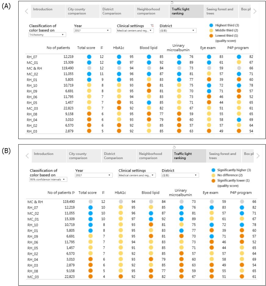
Principle 4: Simplicity Through Synthesis
A crucial feature of a dashboard is the ability to reveal several charts with related but different indicators. However, many participants of the focus group expressed difficulties in decision-making if different indicators showed conflicting results. For example, it is difficult to compare the level of diabetes care quality between two hospitals when one hospital has orange for two indicators and blue for two indicators, and another hospital has orange for one indicator, yellow for two indicators, and blue for one indicator. To solve this problem, the focus group suggested a synthesis principle to reduce decision-making stress. In some circumstances, a dashboard designer can use a sophisticated approach, such as a complex formula or statistical modeling to synthesize all indicators into one composite index. For example, the vital statistics performance index is a composite of six dimensions of vital statistics from the simulated model 54.
In this study, the focus group used a simple approach (i.e., summation). They assigned a score of 3 for blue lights (good quality), 2 for yellow lights (fair quality), and 1 for orange lights (poor quality). They subsequently totaled the scores for the four process indicators to obtain a total quality score; 12 was the highest, and 3 was the lowest. According to the trichotomy method, the total quality scores ranged from 5 to 12 (Figure 4 A), whereas according to the statistical testing method, they ranged from 4 to 12 (Figure 4 B). We followed the principle of seeing both the forest and trees when designing the traffic light chart (Figure 4), presenting not only the total quality score but also the score for each process indicator. We noted that RH1 and RH3 hospitals had blue lights for the total quality score, but they had orange lights for eye fundus examination (Figure 4 A), thus providing both overall (forest) and specific (tree) information for decision makers.
Principle 5: Storytelling
The literature increasingly emphasizes the importance of using storytelling in dashboard design (please see Section 3.8). In our example for quality of diabetes care, the focus group created seven Story Points for illustration. Different users can tell different stories from the same data set. For example, one participant was a public health nurse working in the Health Bureau of the Taichung City government; she was concerned about physicians’ tendencies to order urinary microalbumin examination. She thus used the district Story Point and determined that Houli, Cingshuei, Longjing, and Waipu were the four districts with the lowest checkup rate. She then used the traffic light chart to identify 16 clinics caring for more than 50 patients with diabetes in 2017 with checkup rates less than 20%. She called these clinics and asked physicians why they did not check urinary microalbumin and received various responses. This allows her to plan different intervention projects based on the reasoning provided.
Similarly, another participant used the district Story Point to identify five districts (Longjing, Dongshih, Shinse, Heping, and Dadu) with the lowest eye examination rate. He further collected data of eye clinics in each district and marked them on the map. He found that there were no eye clinics in Heping or Shinse and only one clinic in Longjing, Dongshih, and Dadu. He further contacted the eye clinic physicians and was told that there was no formal cooperation with local clinics with regard to eye fundus examination for patients with diabetes. He thus wrote a recommendation to improve eye examination in these five districts.
Discussion
After reviewing the literature on dashboard design principles and applying these recommended principles to create performance dashboards for quality of diabetes care for the Health Bureau of the Taichung City government, the focus group modified these principles and proposed the memorable 5S principles: 1) seeing both the forest and trees, 2) simplicity through self-selection, 3) simplicity through significance, 4) simplicity through synthesis, and 5) storytelling. The 5S principles provide a helpful guide for non-IT professionals and nonexpert casual users to design effective dashboards by adopting SSBI tools.
One of the contributions of this study was the systematic review of the literature on dashboard design principles with a summary of crucial concepts in Section 3. Because different authors have used different terms for similar principles and techniques, the focus group proposed an easily memorized mantra for dashboard designers to follow. They thus mimicked the 5S method of workplace organization to proposed the 5S dashboard design principles, which can help non-IT professionals and nonexpert casual users to efficiently and effectively design dashboards that can provide insightful and actionable information for decision makers.
Two other crucial contributions of this study were the third and fourth principles (simplicity through significance and simplicity through synthesis), which have not been mentioned in the literature. Unlike those in previous studies, most participants of our focus group were not IT experts; thus, they could provide different points of view without referencing the domain knowledge and daily decision-making required by IT professionals. The two newly proposed principles are intended to help solve decision-making problems encountered by health care professionals in the public sector. We believe that these decision-making problems (conflicting results from excessive and discordant indicators) are also common in other domains.
Another contribution was the proposal of storytelling as a principle. In the dashboards designed by the two participants mentioned in Section 5.5, more specific, prosaic options were composed in the navigation bar across the top of the display such as “identify districts with the lowest checkup rate,” “identify clinics with the lowest checkup rate,” “location of eye clinics that can transfer for eye examination,” and “why did physicians did not check urinary microalbumin?” to help users more clearly understand the plots of their desired stories. However, Figures 2–4 reveal only generic descriptions such as “city comparison,” district comparison,” and “traffic light ranking.” The use of text and annotation can help users to fully understand the context of the story.
Watson noted that many newer visualizations using sophisticated coding techniques are difficult to interpret, especially for senior executers. He reminded designers to ask themselves “are we creating visualizations that are too difficult to understand?” He further suggested introducing a new job, “data interpreter,” who explains visualizations to executives, line-of-business managers, and other users who require help interpreting them. The data interpreter must understand the audience, business domain, problem that the visualization is meant to address, and visualization itself, in addition to having storytelling ability and excellent communication skills 55.
Simply knowing the 5S principles cannot guarantee the creation of effective dashboards. Many people have read the classic style manual The Elements of Style by William Strunk, Jr. and E. B. White, but not all of them can write good articles. Repeated practice and feedback are essential for learning a skill. Another crucial factor in designing effective dashboards is, as Berinato suggested, observing other people’s work for ideas and borrowing inspiration 23. He recommended visiting websites with strong visualization, such as The New York Times or The Economist; the focus group added the Tableau Public Gallery to this list.
Several limitations are worth noting. First, the literature review might not have been exhaustive. However, we already found theoretical saturation of most principles (i.e., many principles repeated in different articles). Second, principles always require a balance between generalizability and specificity. The focus group strove to find this balance. Third, the data we used in this study were relatively simple. However, we believe that many problems encountered by health care workers in their daily decision-making are similar in different professional fields. The 5S principles could still be applied to other domains.
In conclusion, the 5S dashboard design principles are easily memorized and practical principles and enable non-IT professionals and nonexpert casual users to design insightful dashboards efficiently by using SSBI tools.
References
- 1.Chen H, Chiang R H L, V C Storey. (2012) Business intelligence and analytics: from big data to big impact. , Manag. Inf. Syst. Q 36(4), 1165-1188.
- 2.Few S. (2004) Show me the numbers: designing tables and graphs to enlighten.Oakland,California:Analytics Press.
- 3.Few S. (2006) Information dashboard design: the effective visual communication of data. Sebastopol,California:O’Relly Media,Inc.
- 4.Sarikaya A, Correll M, Bartram L, Tory M, Fisher D. (2018) What do we talk about when we talk about dashboards?IEEE Trans.Vis.Comput. , Graph 29(1), 682-692.
- 5.Shneiderman B, Plaisant C, Cohen M, Jacobs T, Elmqvist N et al. (2017) Designing the user interface: strategies for effective human-computer interface, 6thedition.Hoboken. , New Jersey:Pearson
- 6.Pousman Z, J T Stasko. (2007) Casual information visualization: depictions of data in everyday life. , IEEE Trans. Vis. Comput. Graph 13(6), 1145-1152.
- 7.Imhoff C, White C. (2011) Self-service business intelligence –empowering users to generate insights. TDWI Best Practices Report.
- 8.Alpar P, Schulz M. (2016) Self-service business intelligence. , Bus. Inf. Syst. Eng 58(2), 151-155.
- 10.E R Tufte. (1983) The visual display of quantitative information. , Cheshire, Connecticut: GraphicsPress
- 11.Few S. (2009) Now you see it: simple visualization techniques for quantitative analysis. , Oakland, California:AnalyticsPress
- 12.Shneiderman B. (1996) The eyes have it: a task by data type taxonomy for information visualizations. Proceedings IEEE Symposium on Visual Language , Boulder, Colorado, USA .
- 13.Heer J, Shneiderman B. (2012) Interactive dynamics for visual analysis. , Communication of the ACM 55(4), 45-54.
- 14.Munzner T. (2009) A nested model for visualization design and validation. , IEEE Trans. Vis. Comput. Graph 15(6), 921-928.
- 16.Wong D. (2010) The Wall Street Journal guide to information graphics. , New York:WW Norton & Comparny
- 18.Abela A. (2013) Advanced presentations by design: creating communication that drives action the second edition. , San Francisco, California:Pfeiffer
- 20.Iliinsky N. (2013) Choosing visual properties for successful visualizations. , New York:IBM Corporation
- 21.Borner K, D E Polley. (2014) Visual insights: a practical guide to making sense of data. , Cambridge, Massachussetts:The MIT.Press
- 22.C N Knaflic. (2015) Storytelling with data: a data visualization guide for business professionals. , Hoboken, New Jersey:JohnWiley &Sons,Inc
- 23.Berinato S. (2016) Good charts: the HBR guide to making smarter, more persuasive data visualizations. , Boston, Massachusetts:HarvardBusinessReviewPress
- 24.S D Evergreen. (2017) Effective data visualization: the right chart for the right data. Thousand Oaks,California:SAGEPublications,Inc.
- 25.Wexler S, Shaffer J, Cotgreave A. (2017) The big book of dashboards: visualizing your data using real-world business scenarios. , Hoboken, New
- 26.Matheus R, Janssen M, Maheshwari D. (2018) Data science empowering the public: data-driven dashboards for transparent and accountable decision-making in smart cities. , Gov. Inf. Q. https://doi.org/10.1016/j.giq.2018.01.006
- 27.Maheshwari D, Janssen M. (2014) Dashboards for supporting organizational development: principles for the design and development of public sector performance dashboards. Proceedings of the 8th International Conference on Theory and Practice of Electronic Governance. Guimaraes , Portugal .
- 28.Baskett L, LeRouge C, M C Tremblay. (2008) Using the dashboard technology properly. Health Prog. 89(5), 16-23.
- 29.K W Park, Smaltz D, McFadden D, Souba W. (2010) The operating room dashboard. , J. Surg. Res 164, 294-300.
- 30.Jinpon P, Jaroensutasinee M, Jaroensutasinee K. (2011) Business intelligence and its applications in the public healthcare system. , Walailak J. Sci. Tech 8(2), 97-110.
- 31.B A Wilbanks, P A Langford. (2014) A review of dashboards for data analytics in nursing. , Comput. Inform. Nurs 32(11), 545-549.
- 32.Otten J, Cheng K, Drewnowski A. (2015) Infographics and public policy: using data visualization to convey complex information. , Health Aff 34, 1901-1907.
- 33.H J Watson, Jackson M. (2016) Piedmont Healthcare: using dashboards to deliver information. , Bus. Intel. J 21(3), 5-9.
- 34.Lee S, Huebner T. (2016) Dashboards to help patient education in home healthcare. , Comput. Inform. Nurs 34(12), 545-552.
- 35.Colley A, Halttu K, Harjumaa M, Oinas-Kukkonen H. (2016) Insights from the design and evaluation of a personal health dashboard. The 49th Hawaii International Conference on System Sciences 3483-3492.
- 36.Jinpon P, Jaroensutasinee M, Jaroensutasinee K. (2016) Integrated information visualization to support decision-making in order to strengthen communities: design and usability evaluation. Inform. Doi: 10.1080/17538157.2016.1255626. Health Soc Care .
- 37.Franklin A, Gantela S, Shifarraw S. (2017) Dashboard visualizations: supporting real-time throughput decision-making. , J. Biomed. Inform 71, 211-221.
- 38.S, Dukkipati A, H A Lauria, Bice T, Travers D et al. (2018) The impact of visualization dashboards on quality of care and clinical satisfaction: integrative literature review. , JMIR. Hum. Factors 5(2), 22.
- 39.Dagliati A, Sacchi L, Tibollo V. (2018) A dashboard-based system for supporting diabetes care. , J. Am. Med. Inform. Assoc 25(5), 538-57.
- 40.Gershon N, Page W. (2001) What storytelling can do for information visualization. , Communications of the ACM 44(8), 31-37.
- 41.Segel E, Heer J. (2010) Narrative visualization: telling stories with data. , IEEE Trans. Vis. Comput. Graph 16(6), 1139-1148.
- 42.Hullman J, Diakopoulos N. (2011) Visualization rhetoric: framing effects in narrative visualization. , IEEE Trans. Vis. Comput. Graph 17(12), 2231-2240.
- 43.K L Ma, Liao I, Frazier J, Hauser H. (2012) Scientific storytelling using visualization. , IEEE Comput. Graph. Appl 32(1), 12-19.
- 44.Kosara R, Mackinlay J. (2013) Storytelling: the next step for visualization. , Computer 46(5), 44-50.
- 45.F D Simone, Presta R, Protti F. (2014) Evaluating data storytelling strategies: a case study on urban changes. The Sixth International Conference on Advanced Cognitive Technologies and Applications .
- 46.Figueiras A. (2014) How to tell stories using visualization?. The 18th International Conference on Information Visualisation. DOI 10.1109/IV.2014.78 .
- 47.Lee B, N H Riche, Isenberg P, Carpendale S. (2015) More than telling a story: transforming data into visually shared stories. , IEEE Comput. Graph. Appl 35(5), 84-90.
- 48.S A Arboleda, Dewan A. (2017) Unveiling storytelling and visualization of data.14th SC@RUG2016-2017,38.
- 49.Tong C, Roberts R, Borgo R. (2018) Storytelling and visualization: an extended survey. , Information 9(3), 65.
- 50.D G Murry. (2016) Tableau your data: fast and easy visual analysis with Tableau software, the 2ndedition. Indianapolis, Indiana:John Wiley &Sons,Inc.
- 51.Gapp R, Fisher R, Kobayashi K. (2008) Implementing 5S within a Japanese context: an integrated management system. , Manag. Dec 46(4), 565-579.
- 52.Zhang S, Luo J, Zhu L. (2014) Confidence intervals for ranks of age-adjusted rates across states or counties. , Statist. Med 33, 1853-1866.
- 53.T H Lu, S T Li, W H Ying. (2017) Geographic representations of mortality data with confidence intervals.Circ. , Cardiovasc. Qual. Outcomes10 002763.
Cited by (3)
- 2.Porti Suarez Anna, Popelka Stanislav, 2024, Design Aspects for COVID-19 Dashboards – Evidence from Eye-Tracking Evaluation, International Journal of Human–Computer Interaction, 40(22), 7800, 10.1080/10447318.2023.2272078
- 3.Pamuk Mustafa, Schumann Matthias, 2024, Towards AI Dashboards in Financial Services: Design and Implementation of an AI Development Dashboard for Credit Assessment, Machine Learning and Knowledge Extraction, 6(3), 1720, 10.3390/make6030085